
Anderson supercut reveals Wes’ dedication to symmetry
Cult director Wes Anderson has always had a very visible preoccupation with colour and form, resulting in a body of work in which many fans can identify a specific film from one obscure frame. He’s also very fixated on Owen Wilson, but we’ll let that pass. Anyway, one perceptive Anderson aficionado has conducted a simple, compelling analysis of Wes’ oeuvre that shows just how much effort goes into constructing his perfect shots.
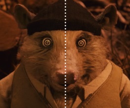
:: kogonada, a South Korean-born filmmaker who contributes to the BFI’s Sight & Sound magazine, recently uploaded the following Wes Anderson supercut to Vimeo. With the simple addition of a dotted line, he demonstrates how meticulously the Grand Budapest Hotel director ensures symmetry in both incidental and key scenes. We haven’t got a lot to say about it, it’s just really pleasant to watch.
So go on, then, watch it.
Isn’t that great? We should probably have got Janina to write this article so she could rave on for twelve thousand words about Wes Anderson’s coruscating genius, but it’s a Wednesday and we’re pretty much happy looking at how lovely and symmetrical everything is. Look at it! It’s like one of those paintings from nursery school where you cover half a page in poster paint and then fold it over.
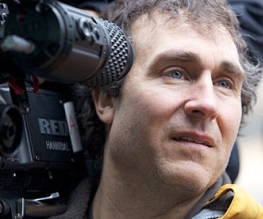
Ironically, of course, Wes Anderson himself isn’t at all symmetrical.

See?

Would like to know what 8 top grossing black films and what their writers were paid. Additionally, explore cinematic traits distinguishing the work of iconic black filmmakers.