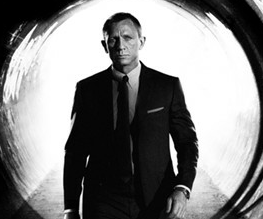
First Skyfall poster keeps it classy

Marketing long running franchises is a tricky business, isn’t it? Do you stick with traditions long set, risking being labelled as predictable but adhering to a style that is obviously successful with die-hard fans? OR do you BRANCH OUT, try a completely new direction and risk being hailed as either a creative genius or an absolute disaster-monger? As we say, it’s tricky. Looks like the Bond babes don’t want to rock the speed-boat. Look! A poster that we know is a thing! A James Bond thing!
OH isn’t it wonderful how they’re paying homage to the great tradition of Bond/OH isn’t it criminal that they can’t be bothered to put any sort of thinking into their campaign. We really like the fact that it shows that a great bit of artwork stands the test of time, and that the legend of Bond himself resonates no matter what else changes/We’re really annoyed that the Skyfall team feel they can rest their shiny shoes on Bond’s tradition, as if to say they know that we’re going to watch the damn thing, so why should they bother. This is great/This is deeply boring. YAY!/BAH!
Right?


Recent Comments