The Top Movie Poster Trends
Just like movie innards, movie posters use a formula according to genre. Red lettering on a white background means a (usually pretty bad) comedy. If it’s an ensemble comedy there will be lots of friendly jostling, partial nudity and a random object (a flute, a midget lounging on a coffin) that promises madcap adventures. Gangster flicks have people standing around looking menacing, romantic dramas have girl resting head on boy’s shoulder, and romantic comedies have girl playfully ensnaring boy by lightly choking him. Here are a couple more tropes for you:
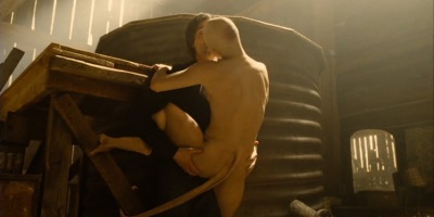
Open Legs

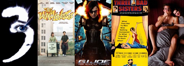
As seen in The Comebacks, 3:10 to Yuma, For Your Eyes Only, Naked, Thirst
You would think that this style of postering was a little risqué. Some countries have certainly thought so; when the poster for Korean drama Thirst was released, the makers were asked (ok, its Korea- they were probably forced) to re-make it in a more delicate manner. So they chose to just scrap the legs, leaving the poster as a torso straddling a man. That’s even worse! The tradition of open legs started with Mr Bond and For Your Eyes Only, and since then has been repeated with surprising alacrity. Even Mike Leigh has used the cliché, adding fishnets for his film Naked. Mike Leigh, I thought better of you.
Why Have Words When You Can Have Number5

As seen in Iron Man 2, X-Men 3, Toy Story 3, Spiderman 3, Scream 3
They think they’re so cool, these number posters. Ooh, the weight of our franchise is so enormous that we don’t even need to tell people the title of it on the poster! I guess it saves a bundle on production; just shove a number in according to the sequel, but it feels a little lazy. The exception to this is Scream 3, because this franchise actually is recognizable (take note, Iron Man 2), and the end result is striking.
Quirky Indie Writing

As seen in Youth in Revolt, Eagle vs Shark, Juno, Nick & Norah’s Infinite Playlist, The Wackness
Gah. Bloody quirky indie films, showing us how indie they are with their hand written titles and colouring in. Michael Cera is the greatest culprit here, appearing in no less than three – three! – of the titles. If a film poster ever has hand written lettering, rest assured that it will also have:
a) cool geeks
b) ironic wearing of sweatbands
c) a soundtrack that includes Belle & Sebastian
However, I have to let The Wackness off the hook, because when Dr Squires (Ben Kingsley) asks what gawky weed dealer Luke’s (Josh Peck) favourite music is, he says De La Soul, The Pharcyde and A Tribe Called Quest, which are definitively the best groups ever.
There Will Be Sexytime

As seen in No Strings Attached, Love and Other Drugs, Blue Valentine, 9 Songs, Last Tango in Paris
This poster promises the viewer that there will be lots of sexytime, no-holds-barred sexytime. Quotes on the poster should be suitably incendiary (“You’ve never seen anything this scorching in cinemas before!”) and taglines should be pervily promising; 9 Songs‘ assures viewers of “69 minutes of sex and rock’n’roll.” Yeah yeah, 9 Songs, we get it.
Oranges and Blueberries

As seen in The Bourne Identity, Australia, GI Joe, Jumper, Stardust
There are a couple of theories on this one, simply because the blue/orange colour palette is used so often, not just in posters but throughout films. One is that the colours are pretty gender neutral and don’t have any connotations (e.g. green and red = Christmas), another is that the direct compliment to skin tone (peach/orange) is blue. There’s a fascinating explanation here, which pretty much concludes that film-makers are lazy bumders.
This Situation Isn’t Suited to My Stereotype!!!!

As seen in Life As We Know It, Death at a Funeral (not the good one), Knocked Up, Big Momma’s House 1 to wherever they’re at now (3?), Date Night
Now don’t get me wrong, here at BFF we would gladly let Tina Fey use our bodies as footstools, but these film posters fall under the crime of announcing themselves as wacky. They advertise the fact that the film will be based around people finding themselves in unusual situations directly out of proportion with their normal selves and exploit my desire to be held hostage by violent gangsters whilst on a date. In these kinds of movies there is usually a straight edge companion, who shakes their head and looks rueful (but amused).
Back to Back

As seen in Gnomeo and Juliet, Two Weeks Notice, Get Smart, Mr and Mrs Smith, Adam’s Rib
I can’t think of a single situation which would necessitate me standing back to back with my boyfriend. However, Valentine’s Day is coming up…should I mock up a poster of us in this awkward pose? The most ridiculous of the poster tropes, and the most inaccurate. The next time I pay to see Two Week’s Notice I’m going to demand a refund if Sandra Bullock and Hugh Grant don’t stand back to back with their arms crossed at some point in the film. I gather it indicates a love/hate relationship between the pair, where the woman is whiny/controlling and the man is whiny/childish and gosh darnit, they just have to work it out!
Though, any of these posters would be more preferable than the Pulp Fiction one when decorating your student digs. Just don’t do it, people.
Recent Comments